Showing posts with label Graphic Design III. Show all posts

INSTRUCTIONS: Apparel Design

GOALS
Two of the biggest parts of apparel design are:
Knowing your MARKET and creating design solutions that support that market (and being able to defend those decisions)
Coming up with an ORIGINAL design

In this assignment, you will need to create (at least) 3 designs for a product line. Your product line should be for something you are familiar with. You MUST find a way to connect all of these designs - AND it must be an original idea!
It must be original.
This assignment is not about curating. This means I am not looking for you to take 3 ideas that you find on the internet and redesign them so they all fit as a cohesive group. I am looking for original ideas as well as original designs.

You do not have to create products that are all the same (i.e. all t-shirts). You will have the opportunity to chose items in your line that are relevant to the industry you are designing for.
Check out product ideas on Spreadshirt and Redbubble.


PROCESS
Step one: Research & Planning
Exhaust yourself! Too often, people do the bare minimum of brainstorming and use their first idea. Remember, your first idea is not refined and is almost never your best idea. 
  • Who is your market? You’ll need to understand your shirt’s place in the market, so consider conducting research to discover the tastes of your customers. Your own personal tastes are a good start, but when it comes down to selling to the masses, data always beats guesswork.
  • Why are you designing a shirt in the first place? What are you trying to say? What is the purpose of your design? Why would someone want to buy it?

Step two: Sketching
Come up with more designs than you need and NARROW DOWN the ones that best fit together. Remember the ideas we talked about concerning themes and connections.

Step three: Design
Photoshop or Illustrator will work. You MUST do this as a vector.


PRESENTATION
You will need to present these designs as digital mockups. People will not purchase an item if they can only see the design itself. Mockups are necessary so that potential buyers can see what your design looks like on the product.


Here are videos on the three most common types of printing apparel:
Screen Printing
Vinyl Printing
Direct to Garment (DTG) Printing

Each process has its own pros and cons.


INSTRUCTIONS: Printing with Bleed Marks

If you are at this point, you should have received corrections from the librarian and separate corrections from me. You should not be doing a final print until you have completed corrections from both of us.
  1. Save your entire document as you normally would
  2. Save your document as a .jpg
  3. Open a new document Adobe InDesign.
  4. For the size of your document put your book cover size BEFORE BLEEDS. Make sure your size is in INCHES, not picas.
  5. Scroll down to the Margins tab. Change ALL margins to ".125in." Make sure your size is in inches. It might automatically convert that number to a picas measurement. (That's ok.) 
  6. Scroll down to the Bleed . This will show you fields for your bleeds.
  7. Put ".125in." for each of your bleeds. You do not need to change the slug.
  8. Click CREATE to open your document.

You will see a document with different colored rectangles. The BLACK line is your document size. The PURPLE line is your safe zone. The RED line is your document bleed edge.

  1. Go to File>Place and place the .jpg of your book cover. It should fit perfectly within the RED bleed lines.
  2. Save your InDesign file.
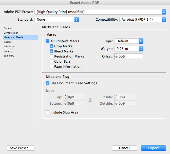
  3. Then go to File>Adobe PDF Presets>High Quality Print
  4. Name and save your .pdf
  5. In the "Marks and Bleeds" tab, make sure  the following TWO items are [✓] checked:
  6. Click "Export"

This whole process generates a .pdf that has markers so you know where your bleeds are and where your cut lines are.


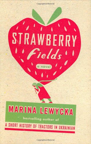
INSTRUCTIONS: Book Cover Redesigns

Problem: An editor at a major publishing house has contacted you and asked if you'll brainstorm new cover concepts for a re-release of a popular book

Additional info: Your design will be a full jacket, therefore you will need to create the front cover, the back cover, the spine, and the inside flaps to wrap around the book.

Requirements: You will need to illustrate one of the Gestalt Principles in your design. As part of your preliminary process, you should be exploring ideas for each of the principles through sketching. Your book cover should entice the reader. It should not give away the story. It should show something about the conflicts and struggles in the story.

As usual, you will need to use a formal design process
1. Research -- this is HUGE on this assignment. Start reading every possible thing about this book -- summaries, themes, analysis, conflicts, etc.
2. Brainstorming and sketching. Write down any possible avenue you could go down with these designs. Don't not include something because it seems far fetched. If it comes into your head, write it down. Then SKETCH.
3. Narrow down and start your design.


ABOUT USING OTHER PEOPLE'S IMAGES...

The Book Cover Process - One Artist's Creative Method

You must CITE any images used. Below are some suggested practices for using artwork that is not your own. Alternatively, you may also use the classroom camera to take photographs of objects that you would like to incorporate into your design [Always the best idea!]

Suggested "best practices" for using the graphic artwork of others
Lincoln Cushing, Docs Populi, 11/30/2007

1. Admit that you are using preexisting art. This happens when you trace, scan, Web grab, or otherwise use someone else's distinctive or substantial design element into your own art. This is often rationalized, and can be a matter of interpretation and judgement. It's one thing to copy a line or a shape, it's another to wholesale lift an entire illustration and use it as your main image. When you do copy something, note where you found it - which URL or magazine article gave it up for you. One easy way to keep track of this information is to drop your citation into Photoshop's "File info."

2. Anticipate the exposure of the piece. Even if you are just making a neighborhood flyer or obscure blog entry, images can spread like wildfire these days. It's always the right thing to give credit when due.

3. Do your research. Where did the image come from? Determining this can often be quite difficult, and many artists (wrongly) assume that it's unknowable. But a little research can go a long way. Start with a few Google Image searches, using various terms that might bring up identical or related pictures. If that fails, turn to other design peers. A final step is to check with art historians - this can include art librarians, authors, and academics who are versed in the subject. An e-mailed attachment query to the right person will reveal who did it, when, and where.

4. Ask for permission. This is probably the hardest step, for many reasons - deadline, difficulty in reaching people, ego, legal concerns - but do it if possible. If what you are doing is respectful and appropriate, you will often find the other artist more than accommodating. Remember, we're a community.

5. Give specific credit on the final piece. This is important for all items, including ones that have drifted into that giant grab-bag we call the "public domain." Don't contribute to our own historical amnesia and cultural imperialism. Say something about where it's from. This can be as simple as a credit line at the bottom in small type.


INSTRUCTIONS: Bookmark Variations

Try different variations using Line, Shape, Color, Texture, Space, Value, or Size. You can also use Pattern, which is not an element of graphic design but could produce interesting variations.

Create at least three variations.

Original
Size and Space


Line

Color


INSTRUCTIONS: Bookmark Contest

This year, we are going to compete in the Massachusetts Librarian Bookmark Contest. The theme for this year is "My School Library is Awesome Because"

Today in class, we will brainstorm concepts and ideas. You will need to sketch out at least 4 different concepts in your sketchbook.


1. RESEARCH
  • What information do you have about this competition? 
  • What have previous entries looked like? 
  • Consider the end result of these bookmarks. Who will be judging? Where will they be used? Who should they appeal to? 
  • What do bookmarks that are not related to this contest look like? 
  • READ THE RULES of the competition! Always know what could disqualify you.
2. METHODS - What will you use to create your artwork? Everything must be original and you cannot use anyone's work in your design. This includes fonts and images!

3. PRELIMINARY WORK
  • Brainstorm concepts and ideas.  
  • Sketch some concepts in your sketchbook. You will need to sketch out at least 4 different concepts in your sketchbook. 
  • Consider the theme and what would make this design dynamic and different from other designs. 


Later....
Once you have a completed design, you will be creating 3 other variations of the same concept where you have experimented with different elements of design. You will be passing in all four as part of your grade, but only one will be submitted to the contest. We will talk more about this as we get further along in the project.

INSPIRATION: Saul Bass

Here are the title sequences we watched in class. 

Here is what title sequences looked like BEFORE Saul Bass:
Flamingo Road
The Wizard of Oz

Here are some links to title sequences CREATED by Saul Bass:
Psycho
It's a Mad, Mad World
Vertigo 
Ocean's Eleven (1960)
Bunny Lake Is Missing

Here are some links to title sequences created by other artists that were clearly INSPIRED by Saul Bass.
Mad Men
Catch Me If You Can
X-Men
Lemony Snickets

INSTRUCTIONS: Saul Bass Poster


If you have never seen Rocky, here is the scene in the movie that inspired the design. 


BASED ON THE IMAGES YOU HAVE SEEN,WHAT SIMILARITIES DO YOU SEE IN SAUL'S STYLE?

Specifically, what commonalities do you see in his style (if any) of:
Line    Shape   Form   Space   Color   Texture
(these are the elements of art)
 
Choose a great movie that you know very well. You will be creating a poster for that movie in the style of Saul Bass. You must mimic Saul's style for his use of Line, Shape, Value, Color, Texture, Size, Space and Type. You should also develop symbolic imagery that has the same components.

Your idea should illustrate something about either the THEME(s) or the CONFLICT or both. It should not illustrate the plot. The plot describes the main events of the story. A poster promoting a movie should entice a person to see it. A person should wonder "What is this about?" If you illustrate the plot or the major events in the story in the poster, why would anyone need to see it?


THEME

A story can have multiple themes -- Death  •  Loneliness  •  Betrayal  •  Triumph  •  Survival  •  Deception  •  Love  •  Fear  •  Isolation  •  Coming of Age  •  Freedom  •   Escape  •  Discovery  •  Justice  •  Ambition
Check out this list of literary themes. Which ones apply to your movie?


CONFLICT

Conflict refers to the struggle in the story. Every movie has a conflict. It's the 'thing' we are waiting for a resolution on. It's why we continue to watch a movie for 2 hours (or more). We are waiting for some type of conflict resolution. Conflicts can be internal or external.

INTERNAL CONFLICT
(Hu)man vs. Self


    or

    EXTERNAL CONFLICT
    (Hu)man vs. (Hu)man
     

    (Hu)man vs. Nature
     

    (Hu)man vs. Society
     

    (Hu)man vs. Technology or Supernatural